Adding styles for text annotations
View as MarkdownMarkdownGitHub Flavored Markdown(GFM) supports some emphasises like so:
Emphasis, aka italics, with _asterisks_ or _underscores_.

Strong emphasis, aka bold, with **asterisks** or **underscores**.

Combined emphasis with **asterisks and _underscores_**.

Strikethrough uses two tildes. ~~Scratch this.~~
That's usually sufficient for taking notes but sometimes not, for example, when it comes to annotating text. It is no surprise that you think of extending GFM syntax to support additional emphasises. However, it breaks the compatibility so you basically cannot use it on other places.
In Inkdrop, you make notebooks for each purpose. Inkdrop lets you change styles of those emphasises that only apply to a particular notebook so you can keep your notes fully compatible with GFM. For example, if you want to quote and highlight texts from books you read, you make a notebook named something like "Reading". And you can define stylesheets only applied to notes in this notebook.
Enable Development Mode
Let Inkdrop run in Development Mode by selecting the Inkdrop > Preferences menu, clicking the General tab on the left hand navigation, and check the "Development Mode", then reload the app by pressing Alt+Cmd+Shift+R / Alt+Ctrl+R
Check the class name of the editor
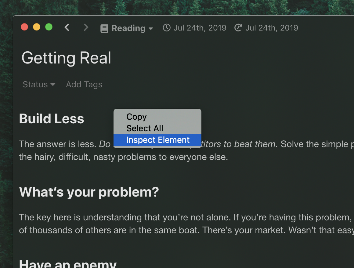
First, open a note in a notebook which you would like to add custom highlightings ("Reading" in this example). Then, right-click on the preview pane and select "Inspect Element".
Developer Tools shows up. Find a div element with "editor" class as following:
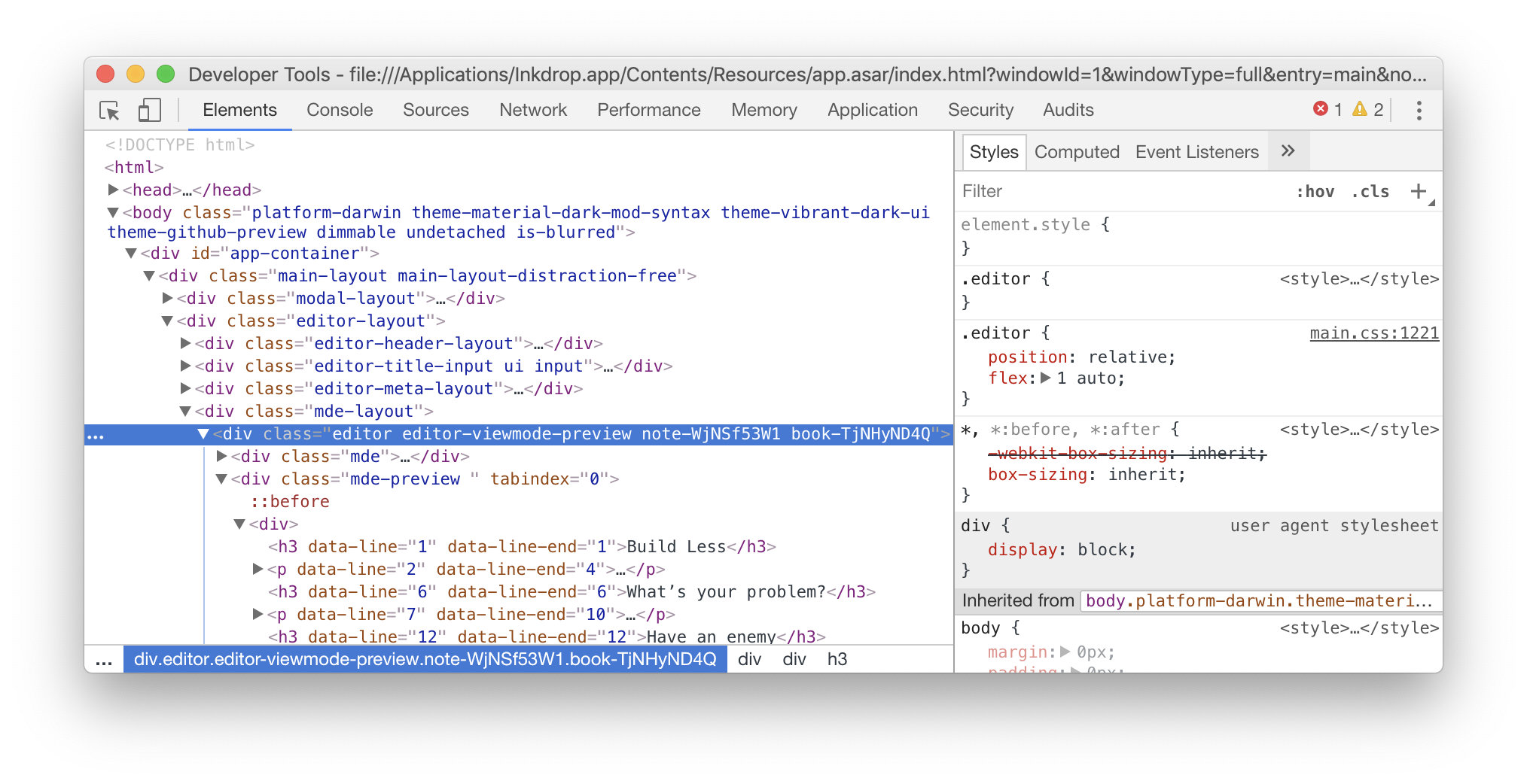
In this example, you can see the div element has "editor editor-viewmode-preview note-WjNSf53W1 book-TjNHyND4Q" class, where book-TjNHyND4Q is the class name for "Reading" notebook.
You get it? With this class name, you can add notebook-specific stylesheets!
Add special emphasise stylesheets for a notebook
Create a styles.css in your data directory and write some CSS like the following:
.editor.book-TjNHyND4Q {
  .mde-preview,
  .cm-editor {
    p {
      line-height: 160%;
    }

    strong,
    .tok-strong {
      font-size: x-large;
      text-decoration: underline;
      text-underline-position: under;
      background-color: rgba(255, 255, 0, 0.1);
      text-decoration-color: rgba(200, 160, 0, 0.5);
    }
    em,
    .tok-emphasis {
      font-weight: bold;
      font-size: large;
      text-decoration: underline;
      text-underline-position: under;
      background-color: rgba(255, 255, 0, 0.1);
      text-decoration-color: rgba(200, 160, 0, 0.5);
    }
  }
}
Reload the app by selecting the Developer -> Reload menu or by pressing Alt+Cmd+Shift+R / Alt+Ctrl+R.
Then, boom! You should see that your notes got special highlightings for italic and strong emphasises.
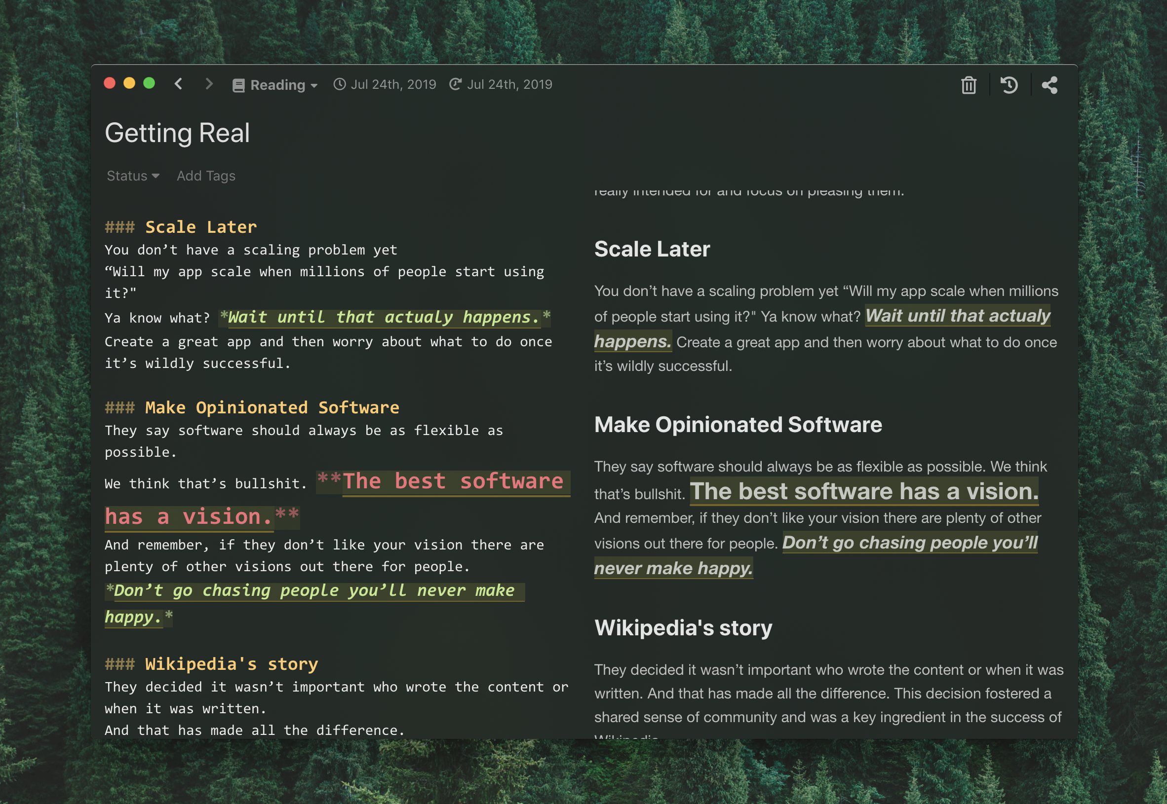
Of course, you can tweak styles as you like for more notebooks.
Tweak colors through the theme variables
The rules above target the .tok-* classes directly, which works but re-implements what the syntax theme is already doing.
When all you want is a different color, weight, style, or decoration, it's simpler to override the variables the theme reads.
Inkdrop splits them in two: the --syntax-* variables drive the .tok-* classes inside .cm-editor, and the --mde-preview-* variables drive the rendered Markdown inside .mde-preview.
Both are ordinary CSS custom properties, so they inherit — setting them on a notebook's .editor.book-* element scopes the syntax theme to that notebook alone:
.editor.book-TjNHyND4Q {
  /* Editor pane */
  --syntax-strong-color: #b45309;
  --syntax-emphasis-color: #b45309;
  --syntax-emphasis-font-style: normal;
  --syntax-strikethrough-text-decoration: line-through wavy;
  --syntax-link-color: #0e7490;

  /* Preview pane */
  --mde-preview-strong-color: #b45309;
  --mde-preview-em-color: #b45309;
  --mde-preview-link-color: #0e7490;
}
@inkdropapp/css defines every one of these with a default value — see the :root block of syntax.css for the editor and of markdown.css for the preview.
Properties that no variable covers, such as background-color, text-underline-position, or font-size, still need the element rules shown earlier.
The two approaches mix freely in the same stylesheet.