Extending the UI
Inkdrop's UI is built on top of React. You can add your own React components to Inkdrop by invoking Layout Manager and Component Manager APIs.
Registering and unregistering a React component
To add your React components, you first have to register them to the component registry.
Then, the registered components can be added to layouts.
Below example registers MyDialog class to the component registry and adds it to modal layout so that you can show it as a modal view.
import type { Environment, IInkdropPlugin } from '@inkdropapp/types'

class YourPlugin implements IInkdropPlugin {
  activate(env: Environment) {
    env.components.registerClass(MyDialog)
    env.layouts.addComponentToLayout('modal', 'MyDialog')
  }

  deactivate(env: Environment) {
    env.layouts.removeComponentFromLayout('modal', 'MyDialog')
    env.components.deleteClass(MyDialog)
  }
}

export default new YourPlugin()
This is described in detail in the Word Count plugin walkthrough.
Available layouts can be found here.
Examples
Take a look at the example plugin which adds bars and buttons, replacing the default note list item view with custom one, etc. Here is a screenshot:
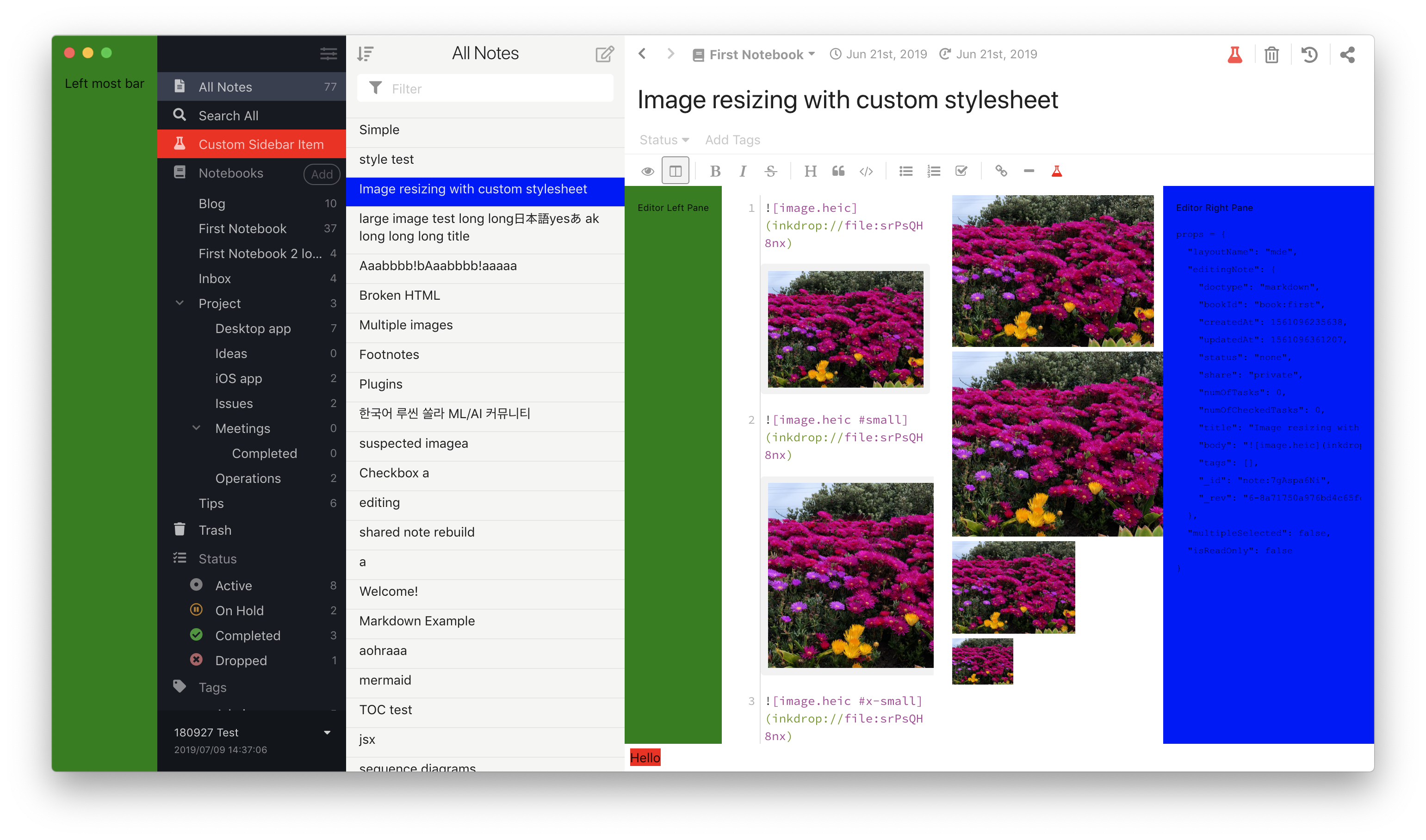
We will explore along with this example to learn how to add components to each layout.
Showing a custom dialog
Inkdrop provides the Dialog component, with Title, Content, and
Actions sub-components for laying one out. Its visibility is driven by the
useModal hook rather than by an imperative handle, so a dialog is
an ordinary function component that shows and hides itself in response to your plugin's
command:
import type { Dialog as DialogClass } from '@inkdropapp/types'
import { logger, useModal } from 'inkdrop'
import { useEffect } from 'react'

import { getEnv } from './env'

export function LayoutExampleMessageDialog() {
  const Dialog = getEnv().components.getComponentClass('Dialog') as DialogClass
  const modal = useModal()
  const { show, close } = modal
  const { visible } = modal.state

  useEffect(() => {
    const sub = getEnv().commands.add(document.body, {
      'layout-example:toggle-dialog': () => {
        logger.debug('dialog was toggled!')
        if (visible) close()
        else show()
      }
    })
    return () => sub.dispose()
  }, [visible, show, close])

  return (
    <Dialog {...modal.state} onBackdropClick={close} onEscKeyDown={close}>
      <Dialog.Title>LayoutExample</Dialog.Title>
      <Dialog.Content>LayoutExample was toggled!</Dialog.Content>
      <Dialog.Actions>
        <button className="ui small button" onClick={close} autoFocus>
          Close
        </button>
      </Dialog.Actions>
    </Dialog>
  )
}
Spreading modal.state passes the dialog its visible flag, and modal.show() / modal.close()
flip it. The as DialogClass cast restores the sub-component types from
@inkdropapp/types — a plain
getComponentClass<DialogProps>('Dialog') only types the props.
The component reaches the environment through getEnv(), the small helper that captures the
instance passed to activate(). See
activate() receives the inkdrop environment
for the rationale, and the Word Count plugin
walkthrough for the helper itself.
Inserting a view into the main layout
It inserts a component into 'main:full' layout.
Adding a sidebar menu item
Adding a view into the editor layout
Adding an editor header button
Adding an editor toolbar button
Adding an editor statusbar item
Replacing the note list item view
Inkdrop uses a custom component registered as 'CustomNoteListItemView' in the component registry.
To register your component as custom note list item view:
env.components.registerClass(
  LayoutExampleNoteListItemView,
  'CustomNoteListItemView'
)
Don't forget to unregister it when your plugin is deactivated:
env.components.deleteClass(
  LayoutExampleNoteListItemView.default,
  'CustomNoteListItemView'
)