This guide targets Inkdrop 6. If you're migrating a theme from Inkdrop 5, see the Plugin Migration Guide from v5 to v6.
Creating a theme
Inkdrop's interface is rendered using HTML and CSS. If you already have experience with web development, you're ready to go!
A theme is a single package that restyles Inkdrop by overriding its CSS variables. One theme can cover all three areas of the app at once:
- The app UI — the sidebar, the note list, drop-down lists, and the tool bar.
- The editor — the note, gutter and other elements inside the editor view, including syntax highlighting.
- The preview — the header, texts, code blocks and other elements inside the rendered Markdown preview.
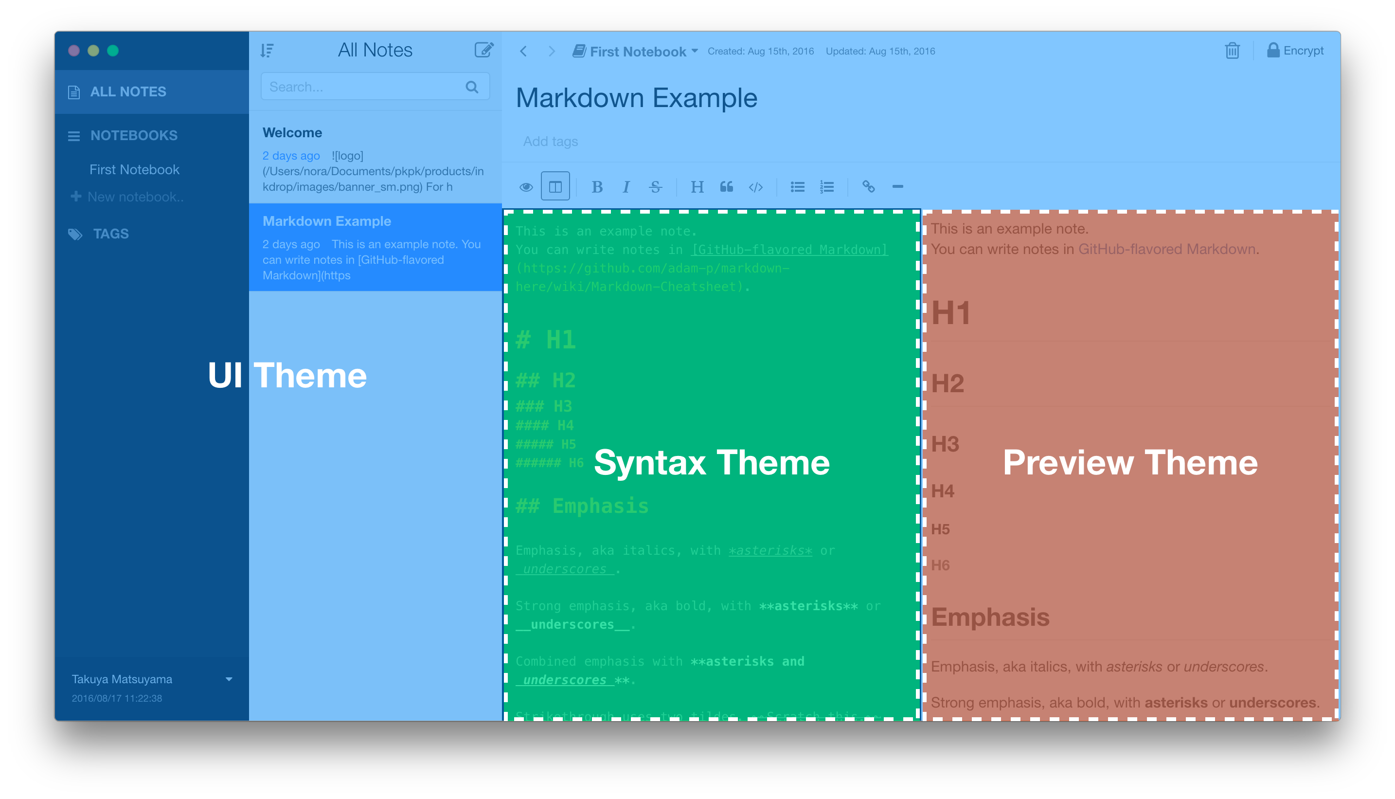
In Inkdrop 5 these were three separate theme packages (UI, Syntax, and
Preview), each selected independently. Inkdrop 6 merges them into one unified
theme, declared with "theme": true and selected from a single
Theme drop-down. See Themes are now a single, unified
type
in the migration guide if you're combining three v5 packages into one.
The theme can be changed from Preferences which you can open by selecting Inkdrop > Preferences on macOS or File > Settings on Windows and Linux, and clicking the Themes tab on the left hand navigation. Themes can be also installed with Inkdrop Plugin Manager.
Prerequisites
- Node.js (>= 24) - Used to install dependencies and run the theme development tools (
npx dev-server,npx generate-palette). - WSL on Windows - It's required to run the development server on Windows.
Getting Started
Themes are pretty straightforward but it's still helpful to be familiar with a few things before starting:
- CSS Variables are entities defined by CSS authors which contain specific values to be reused throughout a document.
- You may also want to review the concept of a
package.json(as covered in Inkdroppackage.json). This file is used to help distribute your theme to Inkdrop users. - Your theme's
package.jsonmust contain athemekey set totruefor Inkdrop to recognize and load it as a theme. (The old string values"ui","syntax", and"preview"are no longer supported — see the migration guide.) - You can find existing themes to install or fork in the Inkdrop themes registry.
Anatomy of a theme
A theme is a package whose package.json sets "theme": true, declares its light/dark themeAppearance, and lists its stylesheets:
{
  "name": "motif",
  "theme": true,
  "themeAppearance": "dark",
  "styleSheets": ["ui.css", "syntax.css", "preview.css"],
  "scripts": {
    "prepublishOnly": "generate-palette"
  },
  "devDependencies": {
    "@inkdropapp/theme-dev-helpers": "^0.6.0"
  },
  "engines": { "inkdrop": "^6.0.0" }
}
By convention a theme ships three stylesheets — one per area:
styles/ui.css— restyles the app chrome by overriding the UI component variables.styles/syntax.css— restyles the editor and its syntax highlighting via the--editor-*,--syntax-*, and--md-*variables.styles/preview.css— restyles the rendered Markdown preview via the--mde-preview-*variables.
You don't have to fill in all three — a theme that only restyles the editor can ship just syntax.css. But shipping the full set is what makes a theme feel cohesive across the whole app.
Themes own their cascade layers
This is the one structural rule to remember. Each stylesheet must wrap its rules in the matching cascade layer — theme.ui, theme.syntax, or theme.preview:
@layer theme.ui {
  :root {
    --page-background: var(--color-neutral-50);
    --sidebar-background: var(--color-neutral-100);
  }
}
Inkdrop injects your stylesheets verbatim — it no longer wraps them in a layer for you. The app's built-in defaults live in the theme.ui.base / theme.ui.components, theme.syntax.base, and theme.preview.base sub-layers, and a layer's own rules outrank its sub-layers. So wrapping your overrides in @layer theme.ui (etc.) lets them win over the defaults reliably, without resorting to high-specificity selectors. The ipm scaffold sets this up for you.
Scaffolding a theme with ipm
The quickest way to start is the ipm CLI, which scaffolds a ready-to-edit theme into a new directory:
# Creates ./motif with theme: true and styles/{ui,syntax,preview}.css
$ ipm init motif --type theme
When the name contains light or dark, ipm sets themeAppearance accordingly; otherwise it asks which one to use. Run ipm init with no arguments to launch an interactive wizard that prompts for the name and type.
Enabling Development Mode
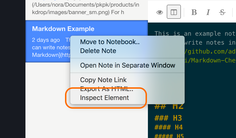
Development Mode enables the "Inspect Element" context menu in Inkdrop, which helps you build your themes easier. Select the menu Inkdrop > Preferences on macOS or File > Settings on Windows and Linux, click the General tab on the left hand navigation, and check the "Development Mode", then reload the app by pressing Alt+Cmd+Shift+R / Alt+Ctrl+R
Now you can use Chrome's Developer Tools. Right-click an HTML element you can to inspect its styles.
You can check how it's styled with themes in the Developer Tools like this:
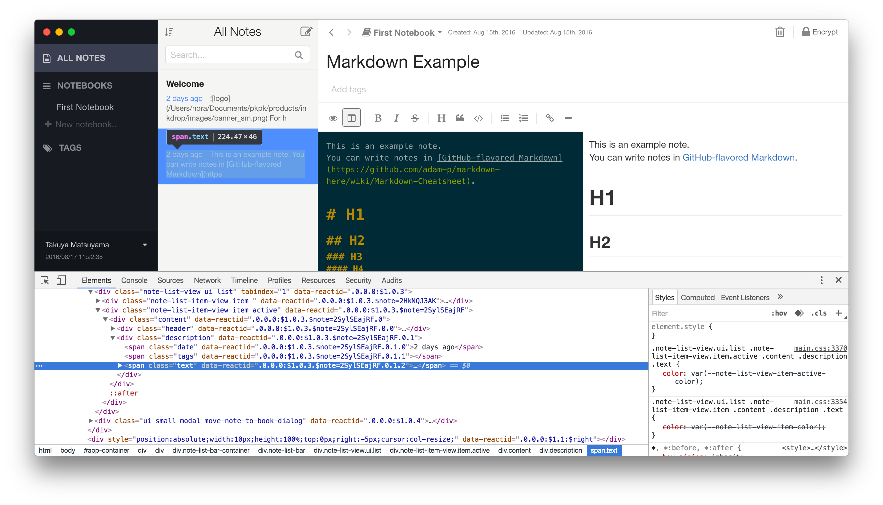
Check out Google's extensive tutorial for a short introduction.
Installing the dev-tools plugin
There is a plugin called dev-tools that provides a set of useful tools for plugin development.
For theme development, it allows you to enable hot reloading of the current active theme. When you made any changes to your theme, it will reload the stylesheets automatically. So, you don't have to reload the entire app manually every time you made changes.
To start, select the menu Plugins → dev-tools → Start hot reloading themes. To stop, select the menu Plugins → dev-tools → Stop hot reloading themes.
Creating your first theme
Let's create a theme called motif-dark. To set it up for local development, do the following:
- Run
ipm init motif-dark --type themeto scaffold the theme into./motif-dark. Because the name containsdark,ipmsets"themeAppearance": "dark"inpackage.jsonfor you — when the name has neitherlightnordark, it asks which one to use. - Open a terminal in the
motif-darkdirectory. - Run
npm installto install dependencies. - Run
ipm link --devto symlink your repository to<USER_DATA>/inkdrop/dev/packages. You can find the user data directory as described on this page. - Reload Inkdrop using Alt+Cmd+Shift+R / Alt+Ctrl+R
- Enable the theme via the "Theme" drop-down in the "Themes" tab of the Preferences
- Start hot reloading by selecting the menu Plugins → dev-tools → Start hot reloading themes
- Run
npx dev-serverto start the development server (handy for browsing the available variables — see below) - Edit the stylesheets in
styles/to customize the theme - Publish your theme —
palette.jsonis generated for you on publish (see Generatingpalette.json)
Now you are ready to make changes! The three sections below walk through each stylesheet.
Styling the app UI
Your theme's styles/ui.css styles the app chrome. Most of Inkdrop's UI elements can be customized with CSS variables.
These variables let Inkdrop give meaningful names for styles of the UI components.
For example, --note-list-bar-background variable styles the background of the note list bar.
This approach saves you from handling CSS selector specificities, making your themes easier to maintain.
Add only the CSS variables you want to change, inside the @layer theme.ui block:
@layer theme.ui {
  :root {
    --primary-color: var(--color-blue-500);
    --page-background: var(--color-neutral-50);
    --text-color: var(--color-neutral-600);
    --sidebar-background: var(--color-neutral-100);
    --note-list-bar-background: var(--color-neutral-50);
    --editor-background: var(--color-neutral-50);
  }
}
For the full list of variables you can override, refer to the source CSS files in the @inkdropapp/css package, which the app loads before your theme:
tokens.css— design tokensui.css— the main file that defines CSS variables related to UI componentsstatus.css— note status colors (--note-status-*)tags.css— tag colors (--tag-*)task-progress.css— task progress view colors (--task-progress-view-*)
Running the Development Server
Let's check out what variables are available in Inkdrop. Inkdrop provides a helper tool to list all the CSS variables that are used in the app. Run the following command in the theme project root directory:
npx dev-server
#
#  VITE v5.4.9  ready in 710 ms
#
#  ➜  Local:   http://localhost:5173/
#  ➜  Network: use --host to expose
#  ➜  press h + enter to show help
For Windows users: PowerShell is not supported. You have to run it on WSL.
The development server will start. Open the URL displayed in your console in a web browser.
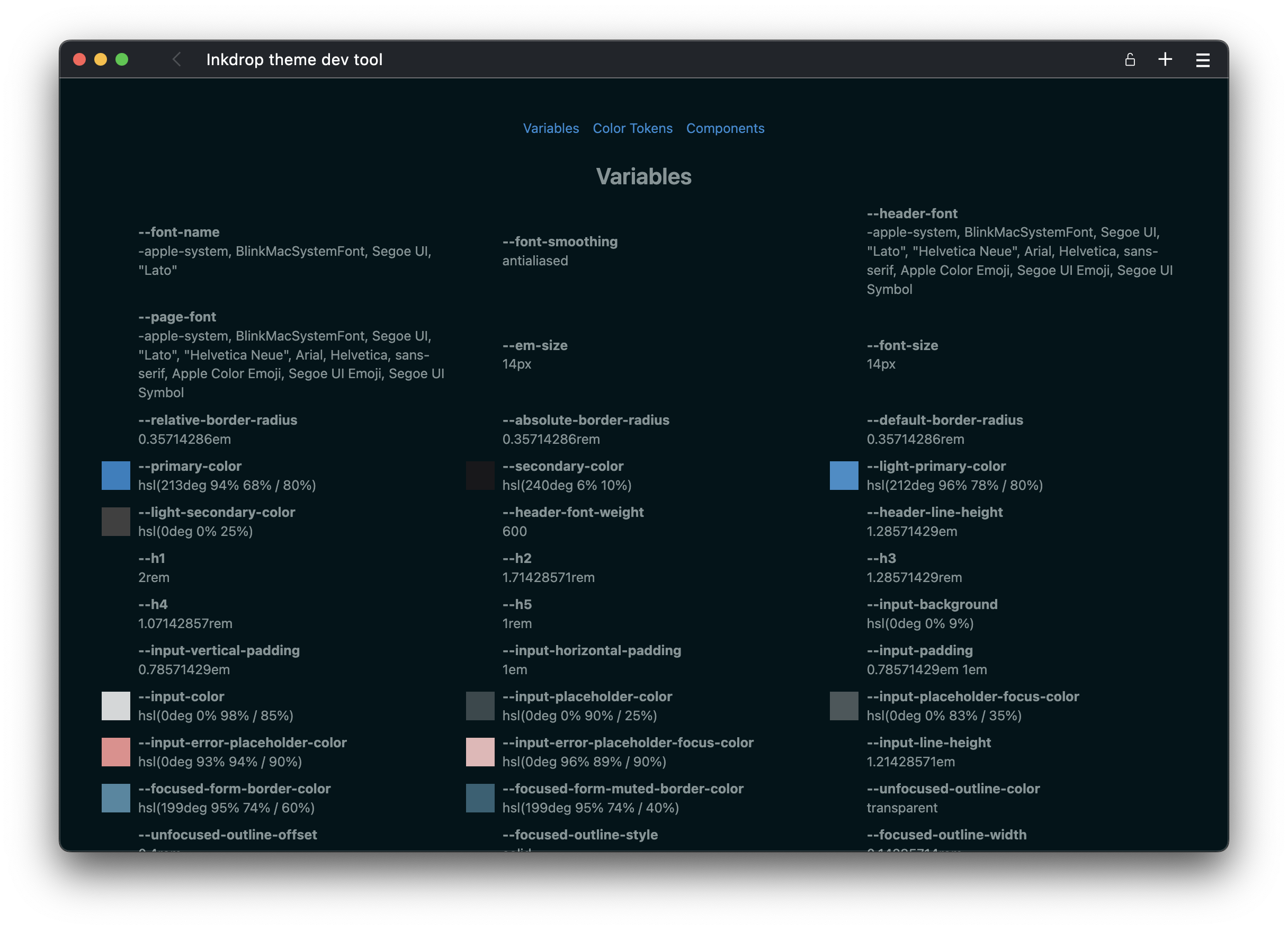
There are three tabs in the tool:
- Variables: Lists all the CSS variables used in the app. As you can see, it includes not only colors but also border radii, sizes, font weights, and more. However, you don’t need to change every variable for your theme
- Color Tokens: Lists all the primitive color variables
- Variables starting with
--color-can be used as color values - Variables starting with
--hsl-define HSL color parameters, such as215deg 28% 17%, which are useful for adjusting opacity, for example,hsl(var(--hsl-gray-800 / 30%))
- Variables starting with
- Components: Previews some components with the current theme. The tool supports hot reloadig, so it will update colors as you modify the variables.
The full set of color tokens is also published in the @inkdropapp/css repository, where you can browse every available --color-* and --hsl-* variable.
Acrylic background support
The app supports acrylic background, which adds a frosted glass effect to the window background. It is currently supported on macOS and Windows 11+.
If this feature is enabled in the app, the body element will have the acrylic-window class name.
So, you can add styles for the acrylic background like this:
@layer theme.ui {
  :root:has(body.acrylic-window) {
    --page-background: transparent;
    --editor-background: hsl(192deg 100% 10% / 70%);
    --editor-drawer-background: hsl(var(--hsl-base04));
    --note-list-bar-background: hsl(var(--hsl-bg-muted-highlight) / 70%);
    --sidebar-background: hsl(var(--hsl-bg) / 70%);
    --inline-dropdown-menu-background: hsl(var(--hsl-base04));
  }
}
It makes the background transparent, and increases transparency of the editor, note list bar, and sidebar.
On Windows, the window background opacity is lower than on macOS. So, you may want to adjust the styles by specifying the platform selector like so:
@layer theme.ui {
  :root:has(body.acrylic-window.platform-win32) {
    --page-background: rgb(0 0 0 / 40%);
  }
}
Styling the editor
Your theme's styles/syntax.css styles the editor and its syntax highlighting. It's just a set of CSS variables you set in a :root { … } block — no selectors of your own. The full catalog of variables, each with its default value, lives in @inkdropapp/css's syntax.css. Browse that file to see every variable you can override, then copy the ones you want to change into your :root block. The rules that actually paint the highlighting (.tok-*, .md-*) live in the same @inkdropapp/css package and read your variables, so recoloring the editor means changing variable values, not writing CSS rules.
The variables fall into three families:
- The editor chrome —
--editor-*variables for the background, foreground, gutter, cursor, selection, tooltips, brackets, and more. - The syntax tokens — one
--syntax-*variable per Lezer highlight token (--syntax-keyword-color,--syntax-string-color,--syntax-comment-color, …), plus-font-style/-font-weight/-text-decorationvariants where relevant.@inkdropapp/cssmaps these onto the.tok-*classes it emits inside.cm-editorand.mde-preview .codeblock(the latter styles rendered preview code blocks). - The Markdown-specific tokens —
--md-*variables that style Markdown-specific syntax, such as fenced (triple-backtick) code blocks, inline code, highlight marks, and tables.
Set those to whatever colors you like — for example, the values reference the primitive color tokens from @inkdropapp/css, which come in two forms:
--color-<family>-<scale>— finished, opaque colors, e.g.var(--color-violet-600).--hsl-<family>-<scale>— the underlying HSL triplets, e.g.hsl(var(--hsl-violet-600) / 13%), for when you need an alpha channel.
Reaching for these design tokens is optional, though. Each --editor-* / --syntax-* / --md-* variable accepts any CSS color, so a custom theme is free to define its own palette — raw #hex, rgb(), oklch(), or whatever you prefer — instead of building on the @inkdropapp/css ramps.
@layer theme.syntax {
  :root {
    --editor-foreground-color: var(--color-gray-800);
    --editor-caret-color: var(--color-violet-600);
    --editor-selection-background: hsl(var(--hsl-violet-600) / 13%);

    --syntax-keyword-color: var(--color-violet-600);
    --syntax-string-color: var(--color-green-600);
    --syntax-comment-color: var(--color-slate-400);
    --syntax-comment-font-style: italic;
  }
}
A couple of conventions keep this easy to fill in: modifier variants default to their base token (so --syntax-name-function-color falls back to --syntax-name-color unless you override it), and tokens you don't color fall back to --editor-foreground-color. You only need to set what differs.
The editor runs on CodeMirror 6, so these --editor-* variables and .tok-* classes replace the old CodeMirror 5 .CodeMirror-* / .cm-* selectors. See The editor stylesheet in the migration guide for the full reference and the v5 → v6 selector mapping — in Inkdrop 6 you drive the highlighting by setting --syntax-* variables rather than writing .tok-* rules.
After making changes, the app automatically reflects changes via the dev-tools hot-reloading.
Note: It's advised to not specify a font-family
in your editor stylesheet because it will override the Font Family field in
Inkdrop's settings. If you still like to recommend a font that goes well with
your theme, we suggest you do so in your README.
Styling the preview
Your theme's styles/preview.css styles the rendered Markdown preview. Inkdrop ships the base preview stylesheet inside the app (see @inkdropapp/css's markdown.css), so your preview stylesheet doesn't carry the full GitHub-markdown CSS — it only overrides --mde-preview-* variables on :root. Most of those variables default to the active theme's UI tokens (--text-color, --border-color, --link-color, …), so the preview matches the rest of your theme out of the box, and you set only the handful you want to diverge on:
@layer theme.preview {
  :root {
    --mde-preview-link-color: hsl(var(--hsl-blue-500));
    --mde-preview-heading-color: hsl(var(--hsl-slate-900));
    --mde-preview-strong-color: hsl(var(--hsl-slate-900));
    --mde-preview-em-color: hsl(var(--hsl-slate-700));
    --mde-preview-inline-code-background-color: hsl(var(--hsl-slate-100));
    --mde-preview-blockquote-text-color: hsl(var(--hsl-slate-500));
    --mde-preview-blockquote-border-color: hsl(var(--hsl-slate-200));
  }
}
For non-color tweaks that no variable covers — font weight, letter-spacing, and the like — you can still write ordinary rules inside .mde-preview. The full list of --mde-preview-* variables lives in the :root block of markdown.css; the migration guide's preview-stylesheet section has a table of the most commonly themed ones.
Override the --mde-preview-* variables on :root by
default, the same as the UI and editor stylesheets. The
.mde-preview content root is only for the extra rules that the
variables don't cover — don't confuse it with
.mde-preview-container, the outer wrapper used for keymap and
command scoping.
Diagram colors (Mermaid)
Diagrams rendered by the built-in mermaid plugin follow your theme the same way the rest of the preview does — through CSS variables. @inkdropapp/css's mermaid.css defines a --mermaid-* variable for every color Mermaid can draw (nodes, edges, labels, notes, and diagram-specific ones for sequence, class, state, ER, Gantt, pie, quadrant, C4, and more), and the plugin always renders with a theme that reads those variables. There's no theme option to pick anymore — restyling diagrams is just overriding variables in your preview.css, like everything else in this stylesheet.
A handful of base tokens carry the actual colors, and most of the rest cascade from them via var() — for example, --mermaid-actor-background-color (sequence-diagram actors) defaults to --mermaid-node-background-color. So overriding a few base tokens restyles most diagram types at once, and you only need the specific token when you want a single surface to diverge:
@layer theme.preview {
  :root {
    --mermaid-node-background-color: var(--color-violet-50);
    --mermaid-node-border-color: var(--color-violet-600);
    --mermaid-line-color: var(--color-slate-700);
    --mermaid-cluster-background-color: hsl(var(--hsl-slate-400) / 12%);
  }
}
Three tokens — --mermaid-primary-color, --mermaid-secondary-color, --mermaid-tertiary-color — seed Mermaid's categorical scales (pie slices, git branches, quadrant backgrounds), so overriding those three retints every chart that draws from a palette rather than a single color.
The full list of --mermaid-* tokens, with their defaults and what cascades from what, lives in mermaid.css.
Mermaid diagrams render to inline SVG once, at render time — each
--mermaid-* value is resolved to a concrete color and baked into the SVG,
rather than the SVG referencing var(--mermaid-*) live. This means an
already-rendered diagram doesn't recolor itself the instant you switch themes,
unlike the rest of the preview — it picks up the new colors the next time it
renders (e.g. reopening the note).
Sharing a palette across the three stylesheets
A theme often defines a single set of raw colors and references them from all three stylesheets. Rather than copying those color definitions into each layer, keep them in one shared file loaded first, then reference them from the layered stylesheets via var():
{
  "styleSheets": ["palette.css", "ui.css", "syntax.css", "preview.css"]
}
@layer theme {
  :root {
    --motif-bg: 240deg 13% 14%;
    --motif-fg: 220deg 28% 88%;
    --motif-accent: 197deg 50% 60%;
  }
}
@layer theme.ui {
  :root {
    --page-background: hsl(var(--motif-bg));
    --text-color: hsl(var(--motif-fg));
    --primary-color: hsl(var(--motif-accent));
  }
}
The shared file is wrapped in the plain theme layer, which sits above Inkdrop's base tokens layer and below the per-area theme.ui / theme.syntax / theme.preview layers.
Whether the @layer theme wrapper is required depends on your token
names:
- If your tokens have unique names (e.g.
--motif-accenthere, or Kanagawa's--kanagawa-*), nothing in the app shares those names, so the wrapper is optional — recommended for consistency, but a plain:root { … }works just as well. - If you instead override Inkdrop's built-in design tokens — remapping the
--hsl-neutral-*/--hsl-<accent>-*ramps the way Solarized does — the wrapper is required. Those defaults live in the basetokenslayer, and only by placing your overrides in the laterthemelayer do they win. See recolor by overriding the ramps.
This is how the official Kanagawa and Solarized themes are structured — Kanagawa keeps a palette.css of uniquely-named --kanagawa-* tokens, while Solarized's tokens.css remaps the built-in ramps inside @layer theme; both then map Inkdrop's semantic variables onto those tokens in ui.css / syntax.css / preview.css. Keeping the palette in one place avoids duplicating color definitions and lets you retune the whole theme from a single file.
Optional: recolor by overriding the ramps
This is the right approach only when your theme's palette is shaped like Inkdrop's own design tokens — named color ramps with numeric shades (--hsl-neutral-50…--hsl-neutral-950, --hsl-blue-500, …), the same palette pattern Tailwind CSS uses. If your palette follows that pattern, redefine those ramps directly in a token file (e.g. tokens.css or palette.css) listed first in styleSheets, rather than repointing every component variable by hand. Because the app's component variables resolve through --hsl-neutral-* / --hsl-<accent>-*, overriding the ramps recolors the whole UI from one place; your ui.css then only needs the handful of component variables that differ from the default.
If your theme is instead built on a small set of bespoke colors, keep your own uniquely-named tokens as shown above — don't touch the ramps.
Wrap the file in @layer theme. Inkdrop's defaults for those ramps live in the base tokens layer, and the later theme layer is what lets your overrides win — this is the Solarized themes' approach:
@layer theme {
  /* map your palette onto the v6 ramps */
  :root {
    --hsl-neutral-50: 44deg 87% 94%;
    --hsl-neutral-100: 46deg 42% 88%;
    /* …through --hsl-neutral-950… */

    --hsl-blue-500: 205deg 69% 49%;

    /* re-declare the --color-* wrappers so they pick up the overrides */
    --color-neutral-50: hsl(var(--hsl-neutral-50));
    /* … */
  }
}
Redefine both the --hsl-* ramps and their --color-* wrappers. Components
reference both forms, and re-declaring the wrapper guarantees it resolves
against your overridden --hsl-* value. The @layer theme wrapper is what
makes these overrides outrank Inkdrop's base tokens layer — a token file
that only defines uniquely-named tokens (e.g. --mytheme-*) doesn't need
it. See Sharing a palette across the three
stylesheets.
Example themes
The official themes are good references — each one is a single unified package covering UI, editor, and preview:
- Default Light · Default Dark
- Solarized Light · Solarized Dark
- Kanagawa Wave · Kanagawa Dragon · Kanagawa Lotus
Generating palette.json
Every theme ships a palette.json next to its stylesheets. It's a JSON snapshot of the theme's resolved CSS variables, used to render theme previews and (in the future) by the mobile app.
You don't have to generate or commit it by hand. Every theme scaffolded with ipm includes a prepublishOnly script:
{
  "scripts": {
    "prepublishOnly": "generate-palette"
  }
}
so ipm publish runs generate-palette for you and bundles a fresh palette.json into the published package.
If you'd like to inspect the file before publishing, run the generator yourself at any time from the theme's root directory:
npx generate-palette
Publish your theme
Once you're happy with your theme and would like to share it with other Inkdrop users, it's time to publish it. 🎉
Follow the steps in the Publishing section of the Word Count example. Publishing a theme works exactly the same.