Dialog
Available since v3.5.1.
A built-in React component of Inkdrop that displays a modal dialog.
It is built on top of the Modal component and provides
Title, Content, and Actions sub-components for laying out a dialog.
To get the class of the Dialog component:
import type { Dialog } from '@inkdropapp/types'

const Dialog = inkdrop.components.getComponentClass('Dialog') as Dialog
Dialog is cast to its type so that the Dialog.Title, Dialog.Content, and
Dialog.Actions sub-components are typed. A plain
getComponentClass<DialogProps>('Dialog') only types the props.
Props
Dialog accepts all Modal props in addition to the following:
type DialogProps = ModalProps & {
  className?: string
  children?: React.ReactNode
  // Render the dialog at a larger width.
  large?: boolean
}
Sub-components
- Name
Dialog.Title- Type
- React.FC<DialogTitleProps>
- Description
The header of the dialog.
type DialogTitleProps = {
  className?: string
  children?: React.ReactNode
}
- Name
Dialog.Content- Type
- React.FC<DialogContentProps>
- Description
The main body of the dialog.
type DialogContentProps = {
  className?: string
  // Lay out the content as a flex container.
  flex?: boolean
  // Remove the default padding.
  noPadding?: boolean
  children?: React.ReactNode
  // The CSS `overflow` value applied to the content.
  overflow?: React.CSSProperties['overflow']
}
- Name
Dialog.Actions- Type
- React.FC<DialogActionsProps>
- Description
The footer of the dialog, typically containing buttons.
type DialogActionsProps = {
  className?: string
  children?: React.ReactNode
}
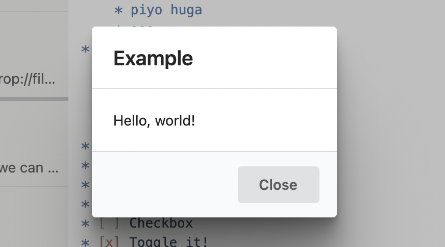
Example
import React, { useEffect, useCallback } from 'react'
import { logger, useModal } from 'inkdrop'
import type { Dialog as DialogType } from '@inkdropapp/types'

const HelloMessageDialog: React.FC = () => {
  const modal = useModal()
  const Dialog = inkdrop.components.getComponentClass('Dialog') as DialogType

  const toggle = useCallback(() => {
    modal.show()
    logger.debug('Dialog was toggled!')
  }, [])

  useEffect(() => {
    const sub = inkdrop.commands.add(document.body, {
      'yourplugin:toggle': toggle
    })
    return () => sub.dispose()
  }, [toggle])

  return (
    <Dialog {...modal.state} onBackdropClick={modal.close}>
      <Dialog.Title>Example</Dialog.Title>
      <Dialog.Content>Hello, world!</Dialog.Content>
      <Dialog.Actions>
        <button className="ui button" onClick={modal.close}>
          Close
        </button>
      </Dialog.Actions>
    </Dialog>
  )
}

export default HelloMessageDialog
A dialog is a top-level overlay, so it only appears once you
register
it and add it to the built-in modal layout — the region where Inkdrop mounts modal
overlays. Do this in your plugin's activate / deactivate:
import HelloMessageDialog from './HelloMessageDialog'

export function activate() {
  inkdrop.components.registerClass(HelloMessageDialog)
  inkdrop.layouts.addComponentToLayout('modal', 'HelloMessageDialog')
}

export function deactivate() {
  inkdrop.layouts.removeComponentFromLayout('modal', 'HelloMessageDialog')
  inkdrop.components.deleteClass(HelloMessageDialog)
}
The name passed to addComponentToLayout (and removeComponentFromLayout) must
match the registered component's class name. If your bundler minifies class names,
pass an explicit name so the lookup stays stable —
inkdrop.components.registerClass(HelloMessageDialog, 'HelloMessageDialog') — and
use that same string in the layout calls.
It produces:
See also
- Modal — the lower-level overlay component that
Dialogbuilds on. - The plugin tutorial that uses the
Dialogcomponent.